
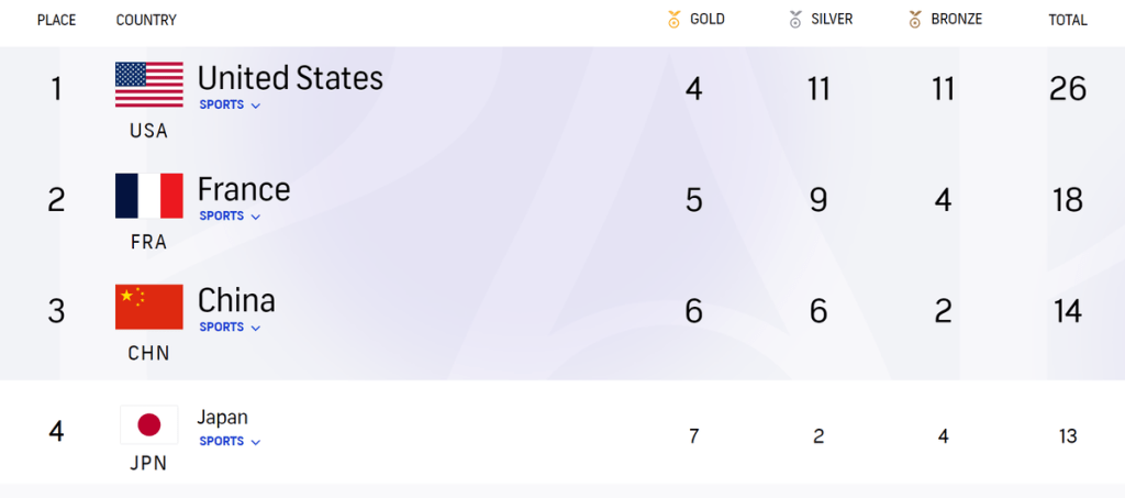
Americans use Fahrenheit to measure temperature. Americans use miles to measure distance. Apparently, Americans use a unique olympics medal tally as well. While basically every country ranks nations first by their gold medal count, and tiebreak by silvers (then bronzes), many US news outlets like to sort by total number of medals won.
For those who followed the games, you may know that the US was basically never first by gold medals until the very last day, which gave international news outlets and Redditors a lot of time to mock them.
As with any real-world scenario that vaguely resembles a mathematical problem, there have been tons of research papers on this exact issue. Being the bored NSF I am, here’s a summary of medal-tally-ology.
Part 1: Taking weights
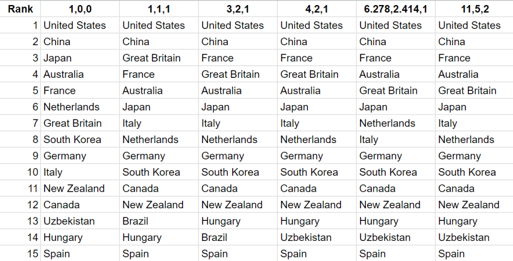
You may have already spotted that both medal tallies are essentially sorting countries by some weighted sum of medals. We can write the weights for gold, silver and bronze medals as a triplet1. For example, sorting by gold medals (the normal way) can be written as (1,0,0)2. Sorting by total medals is (1,1,1).
Put like this, the issue with both methods becomes obvious (if it wasn’t already). The former overweighs golds and the latter underweighs them. For that reason, many people have come up with different weighing systems to even out this discrepancy.
Let me rank by them by cursedn-ess:
Level 1: (3,2,1) – Very sensible, as simple as you can get. Has the effect that gold = silver + bronze.
Level 2: (4,2,1) – You can see why some people prefer exponential weights, because gold compared to silver intuitively feels like a larger gap than silver compared to bronze. Put another way, a gold is worth 2 silvers and a silver is worth 2 bronze. This also matches the prize money given out in Singapore and Hong Kong. According to Wikipedia, this system was first publicised in a NYT blog post, though I’m sure many have thought of it before.
Level 3: (6.278,2.414,1) – The exact values (which involve a bunch of square roots) can be found here. I am truly lost at this one, because a bunch of papers that it references are all locked behind paywalls. To kind of summarise, they considered every possible weighing system satisfying gold>silver>bronze, but also gold-silver>silver-bronze. In 3-d space, this forms a convex cone. The author then calculated the “incenter” of this cone.
Level 4: (11,5,2) – This seems more reasonable then the one above, but trust me it is worse. I am unable to find the complete paper online. It uses something called “volume-based sensitivity analysis” and I won’t even pretend to know what any of those words mean.
Anyways, let’s see how these change the rankings:
Here’s a poorly designed graph for visualisation purposes, showing the relative points from the different weighing systems (here USA=1). Note that this is a log graph.
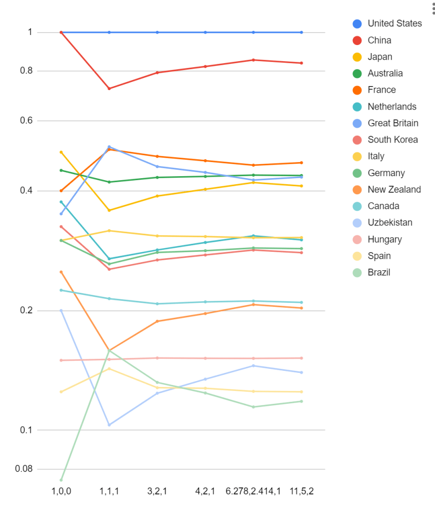
If anything, the chaos in this graph just illustrates what I suspected – it is easy to choose intuitive, logical, even mathematically “correct” weighing systems to favour a particular country. Besides USA and China, every country in the top 15 occupied at least two different positions. While Japan was 3rd in the normal gold-first rankings, it was 6th in all the others. Italy went from 10th to 7th. Britain went from 7th to 3rd and then 5th.
Here’s an idea: what if we consider every possible set of weights? That is exactly what this paper tries to do. To summarise:
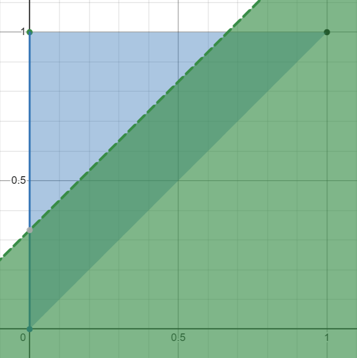
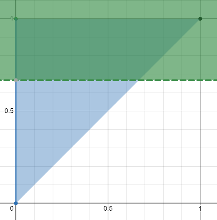
- We can assume that the weight of a gold medal is 1. Then, the following condition describe the set of possible weighing systems:
(Here
is the weight of a silver medal and
is the weight of a bronze medal). By plotting
- Consider two countries
and
. Suppose
golds, silvers and bronzes. Suppose
golds, silvers and bronzes.
- For some weights
. This corresponds to a region on the plane.
- Consider the intersection of the region with the triangle. Any point in the region and in the triangle corresponds to a pair of weights for which
- We can then determine the proportion of weights for which
, we can say that

In short, a country beats another if there are more weights that puts it on top.
Let’s go through an example:
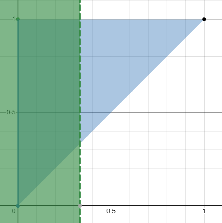
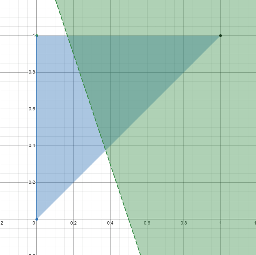
- Australia has 18 golds, 19 silvers and 16 bronzes. Great Britain has 14 golds, 22 silvers and 29 bronzes.
- For Australia to beat Great Britain with weights
.
- This simplifies to
.
- We now plot this equation on the graph of

- We now find the area of the overlapping region, which happens to be about 0.154, or 30.8%, meaning that Australia would win over 30.8% of weights.
- Hence, the algorithm says that Australia is worse than Great Britain.
(Note that it is possible to have a draw, if the line divides the triangle in exactly two halves).
There’s a problem though. “Beating” is no longer transitive, which means that it is possible for A to beat B, B to beat C and C to beat A.
For example,
- Czechia has 3 golds, 0 silvers and 2 bronzes.
- Chinese Taipei has 2 golds, 0 silvers and 5 bronzes.
- Jamaica has 1 gold, 3 silvers and 2 bronzes.
Czechia beats Chinese Taipei 5/9 to 4/9:
Chinese Taipei beats Jamaica 5/9 to 4/9:
Jamaica beats Czechia 5/9 to 4/9:
This means that it is not possible to sort the countries and rank them such that any country with a higher rank beats any country with a lower rank in a head-to-head calculation.
There are 2 ways to fix this.
In the original paper, the author used a football-style league table to decide the winner. We match every country against every other country, and the winner gets 3 points while the loser gets 0. If it is a draw, both teams get 1 point.
If we do this, here is the table we get:
I don’t really like this. The 3 points for a win and 1 point for a draw seems to be arbitrarily decided, and the point of the entire algorithm in the first place is to remove arbitrarily decisions. The only reason I can think of is that it would be nice to give the public whole numbered scores instead of like “Canada – 193.766”. But if said public understood the point system, they would have to understand all the calculations that went into it anyways.3
Since ties are broken by total sum of percentages, and those are much less likely to be tied, why not just sort by that? Here we go4:
Let’s see just how different this is from the widely accepted (1,0,0) weight:
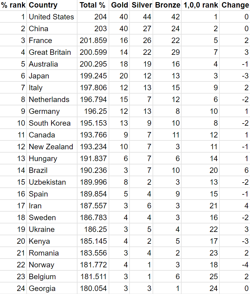
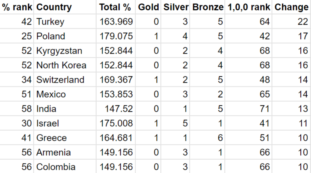
We can now sort by the biggest changes:

I was curious about which two countries had the closest win margin. This turned out to be Spain and Uzbekistan.
Part 2: Population
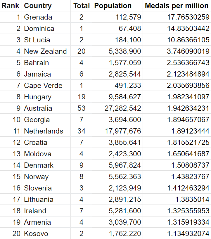
The other complaint that people often have with olympic medal tallies is that it unfairly favours countries with larger population. How can smaller countries even hope to appear in the top 10 of the rankings? The most obvious way to fix this would be to use something like total medals per capita, which would look like this:
There are, however, many problems with this rankings. To summarise the main points:
- Small nations greatly benefit from winning even a single medal. For China to match Dominica’s single medal (gold in the women’s triple jump by Thea LaFond), they would have to win at least 20913 medals.
- There are a limited number of athletes that can be sent to the olympics, so nations cannot just send an equal fraction of their population. If we had say, a million Chinese contestants and enough events to accommodate them, perhaps 20913 medals is within the realm of possibility.
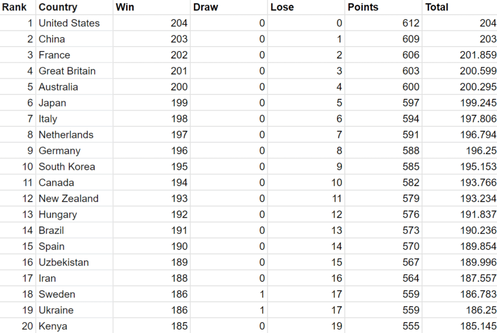
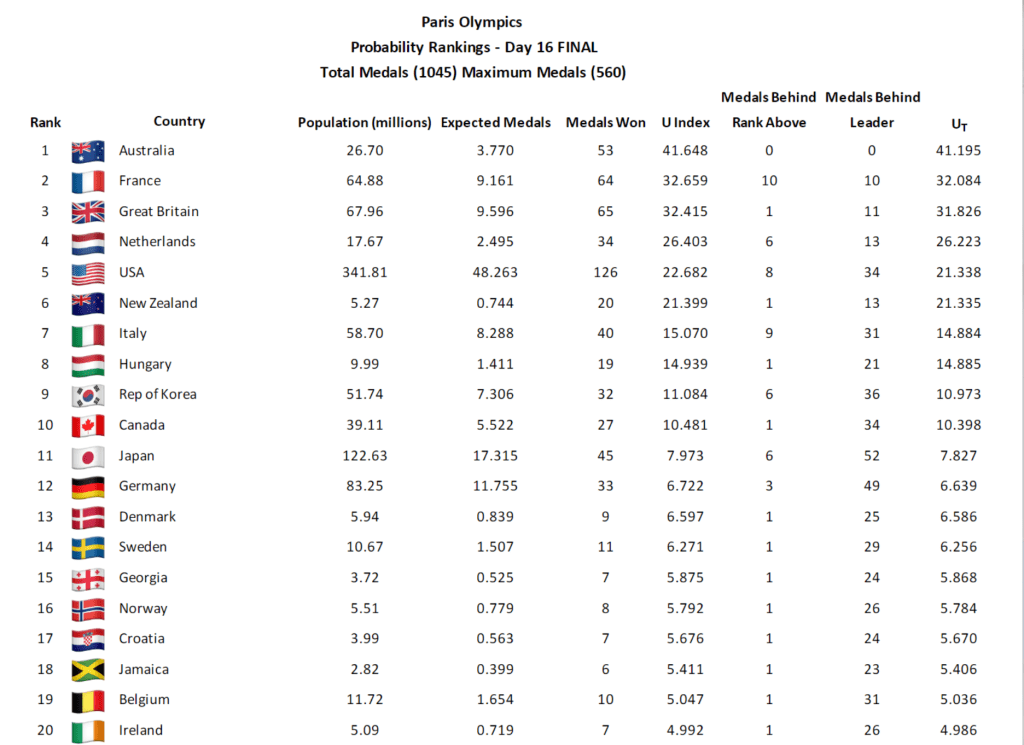
This paper, published in July this year, tries to fix this, by calculating the probability that a country wins the number of medals they did given their population. The Guardian calls it the Goldilocks method, because it balances both the “total medals” and “total medals per capita” rankings.
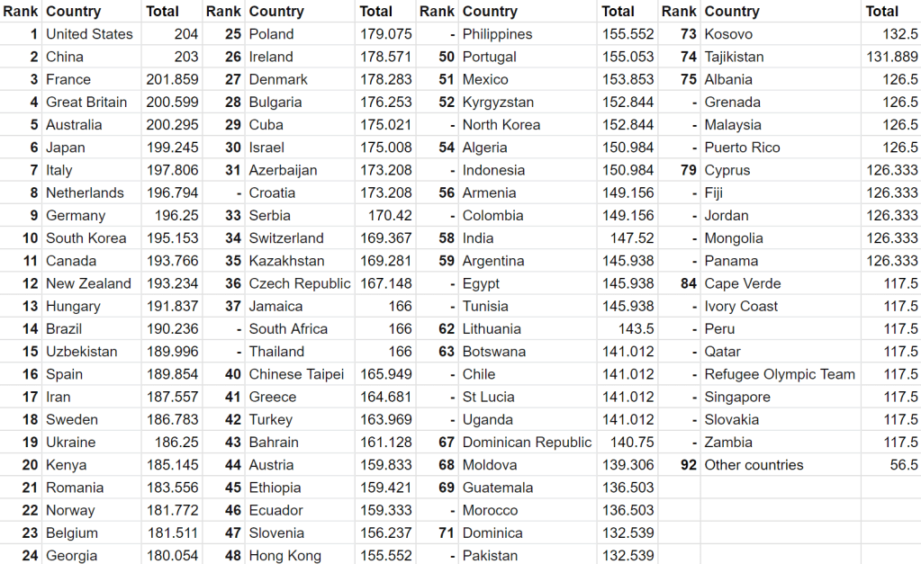
You can view the full rankings over on the authors’ website. Since they have kindly provided the full data, I will not bother doing the maths myself. Here is the top 20:
I found the paper a hard read for some reason, especially because it made the maths so hard to follow (and no LaTeX 😦 ), so here’s a summary:
- Define
as the total number of medals, and
to be the population of country
.
- Find the probability that country
.
- Let
be the actual number of medals they won. The probability that they won at least
.
- Take
.
There is an alternate version where 


And that’s it! (This idea isn’t actually new – I found a youtube video about the same thing).
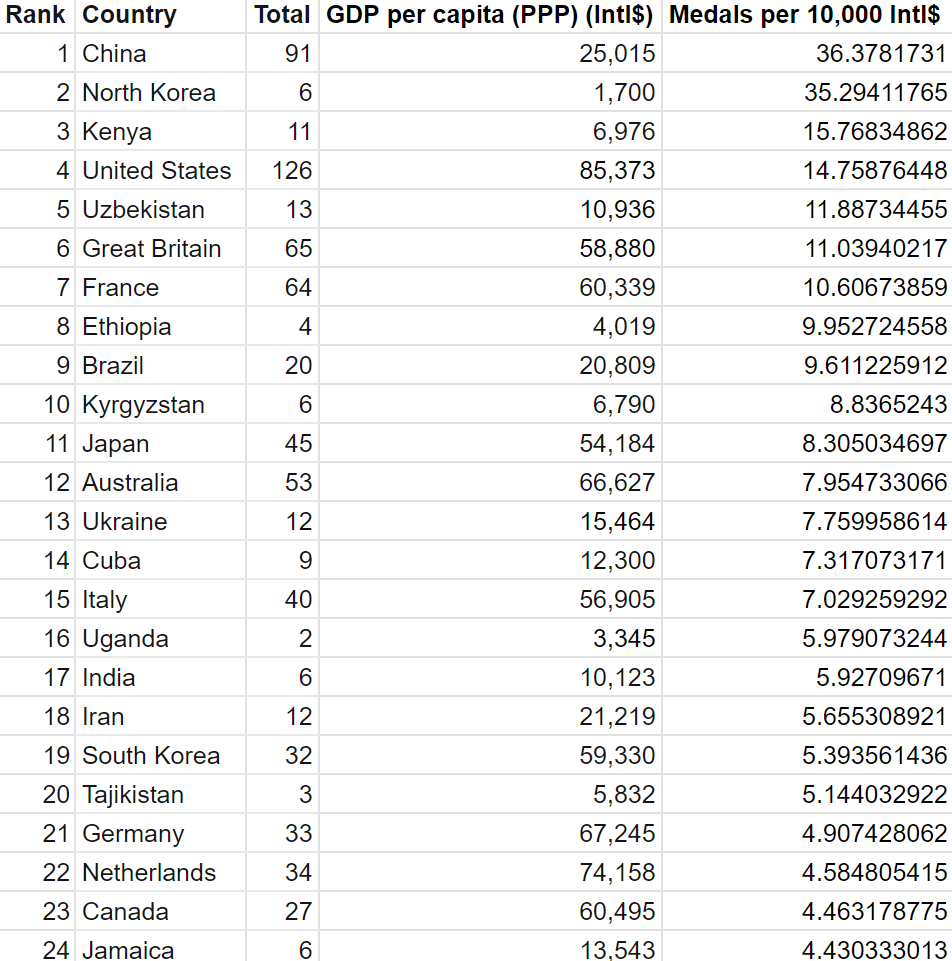
Taking into account population when ranking countries opens a whole can of worms about all the other factors that should be considered, such as GDP(PPP) per capita, funding for sports agencies, etc, all of which has been done before. I will not explore that today, but I want to add that if we consider say GDP, we are no longer measuring “which country produces the best athletes” but “which country produces athletes most efficiently (with the resources they have)”, and these are different questions.
There is one last ranking I want to look at, which is medals per athlete.
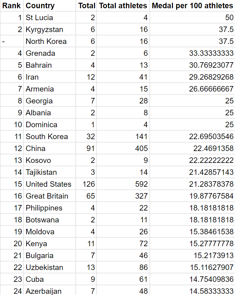
What exactly does this measure? I’m not sure. It’s just a random table…
And that’s it! Hopefully you’ve learnt a little bit more about the various types of medal tallies that have been proposed. Maybe it’s time to invent your own?
Also, here is all the data used:
- You know, while we are here making the medal tally better, I think the argument could be made that we should include 4th places in the tally as well, because for most events (individual or team) it is quite obvious who comes in 4th. ↩︎
- To be more precise, maybe (1,1/100,1/10000) to account for tiebreaks. Similarly, (1,1,1) is more like (1.01,1,0.99). ↩︎
- Also, “Canada-193.766” can be somewhat intuitively explained as Canada being better than 193.766 countries, and is hence ranked 11.234. ↩︎
- This ranking is actually remarkably similar to that of (3,2,1). This is because, as mentioned above, (3,2,1) is the centroid of the triangle (the set of all possible weights). Since we give every possible weight equal importance, a country is likely to beat another if it has a higher (3,2,1) score. The rankings are not identical though – Uzbekistan and Spain are flipped, for example. ↩︎

Leave a comment